
Friday, 31 October 2014
Preparation for Filming Abby
Here we are shown organising what we needed to film Abby as the main protagonist in the music video. We needed to make sure we filmed in the dark as we have decided to film in Iona's house as the back room has windows around it which has a creepy and dark affect that we wanted in representation of the main protagonist. The need for the scrapbook is to show why Abby's character is targeting people for the cage. The candles and apple we are using to create a metaphor about sin and fire. Since it's winter it gets darker quicker which worked out great for us as we need to film in the dark for most of our music video.
Thursday, 30 October 2014
Advert Layout
Today we are considering the layout of our advert and what we want it to look like. We want the main image to be the 4 members of the band lying down with their heads together as displayed in the middle of the layout. All the band members, bar the female lead singer, in black and she will be in colour. Emphasising that she is the only female in the indie rock babe and she is the leader. Appealing to the target audience of the likes of Paramore.

Wednesday, 29 October 2014
Blog Diary: Half Term Holiday
During the half term holiday we have been looking at locations to do the band scene in, in which we have organised with the band which will be shoot on Tuesday 11th of November. We have also been sorting out props such as the cork board and scrap book for the main protagonist that we will be filming on Monday 3rd, Tuesday 4th and Friday 7th November,
We have also booked in for the camera and equipment on Monday 10th and Tuesday the 11th, in order to film band bits.
Over the holidays as well we have also decided how we are going to decorate the band set, something which was suggested in feedback. We have decided that we are going to have clocks on the back ground of the stage, and we have also gathered permission off the drama department to borrow one of there old clock props which would look perfect in our band location.
Tuesday, 28 October 2014
Rough Cut Feedback Analysis
In the feedback presentation we have shown what people liked about our rough cut and what people didn't like.
From the rough cut these are the immediate decisions we have made:
I (Emily Wright) have been taken out of the band due to bad performance in the rough cut. We have replaced me with Jamie Fletcher who will be on the drums, and we have moved the drummer to the keyboard that will feature in the final cut.
We have decided to keep the lead singer as many people agreed that she suited the song. We have also decided to keep her in the same clothes as they suited the band genre. However people have said that she needed to move around more and get more into the song. To improve the singer we have choreographed certain bits of the song in which movements we want her to make. We have also found the singer to be nervous at the start of filming, to prevent this we may get her in earlier than the rest of the band and do run through with her to make her feel more comfortable and get into the song more before the rest of the band arrive.
Many people liked the element of the cage. Because of this we are adding in more cage bits, which will pop up throughout the song to add that mystery factor. We also are adding in bits of Abby by the cage in day time to show how she has set it up.
We are also going to do a quick scene on showing Abby pushing people in to the cage,showing how she did it. We have also purchased latex which will make bruises and cuts on victims more realistic. We have also improved props to make it more obvious why the main protagonist is targeting these people and to show her obsessive nature.
We have also changed the actress in the woods of the rough cut, this is through complaints in the feedback, We have changed the actress with Bethany Carr, who is more likely to take the roll more seriously and look more realistic.
Many people in the feedback said they understood the motifs. However there were a couple of comments that said they had to be more obvious to the audience, because of this we are still deciding on weather to keep the apple motif within the music video, but we are continuing with the chain motif as this is something that relates more to the song.
Ideas we received:
From the rough cut we received an ending idea for the song. This was for the main protagonist to paint an 'X' into the lens, staring directly into the camera. We liked this idea as throughout the music video the main protagonist does looking into the camera for a brief moment, as we thought this showed her to be more crazy and obsessive. Doing this at the end can continue to show the menacing side of her and leave the audience more scared or curious as to what she is going to do next.
Monday, 27 October 2014
Friday, 24 October 2014
Blog Diary: Week 6
This week we have had our rough cut deadline. We are pleased with the rough cut but know that there is a lot of work involved in making the music video as feedback did suggest a 100% re-shoot. We have already booked in days to start filming the Tuesday we get back to school after the holidays. We have taken criticism on board and decided to re film every - creating more of a narrative and make more use of our motifs.
In the feedback a lot was mentioned about our performers, because of this we have decided to change one of the actors and introduce a new drummer into the music video.
Due to members being on holidays during the half term holidays we have decided not to film. Instead we have decided to make the props look as realistic as possible and organise ourselves for filming on the Tuesday, Wednesday and Friday of when we get back.
Thursday, 23 October 2014
Regina Spektor: Digipak Analysis

Because we have used a band for our music project we need to show them as a band, we also want to have a least two images of the band.
You can tell from the font of the writing that appears throughout the digipak that her music is pop/edgy. She sticks with a colour scheme of red, black and white throughout the digipak including the image!
For our Digipak we will stick with our colour scheme which is also red, black and white. We want our font on the digipak to stand out and also represent the genre of music, we will use 'block' writing as this will stand out.
The back of the digipak, where the song names are shown isn't very conventional, but i like how it is different to others, we also like how the name of the songs are also different colours. For the back of our digipak we will stick with the conventions of having a list of the song names, we will probably have the writing in the colour red, but with the bonus track in a different colour.
The front image is just a plain, boring mid shot image of the artist herself, the image does reflect the colour scheme of the digipak, it shows feminine beauty but is a boring image in itself. The use of mise-en-scene with the clothing and makeup that the lead singer wears is effective, as it reflect the quirky side of the album through the use of the hat and the red lips.Our digipak will include a mid shot image of the main singer in the band, we will use different effects on this image to make it eye catching and stand out so that the audience don't look at it and find it boring, as it needs to reflect our song which is up beat and edgy.The use of mise-en-scene all the way through demonstrates the importance of it for this album and this is something that we want to replicate in our own digipak as we feel that it is important. We especially like the red lips used as this could for our alternative rock genre could be a different motif and show seductiveness of the lead singer,
Wednesday, 22 October 2014
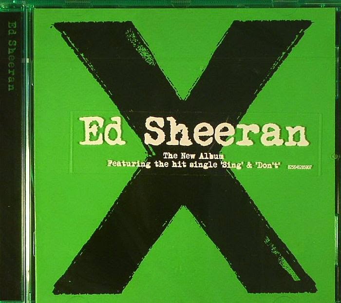
Ed Sheeran: Digipak Analysis
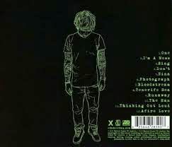
This is the Digipak from Ed Sheeran's, we were particularly interested in this one because of the X, our music video and band logo feature an 'X' which means that the X will have to be used throughout the digipak. The X is the front cover of the album but we would prefer to have this included on either the back or the inside of the digipak. We would also change the colour of the X to reflect our own band so we will probably have it a red colour. The X reflects our band aswell as we have been drafting logos in which the X is used and we want to portray the X ourselves, but through our own band genre. The front of the digipak is quite bare but reflects ed Sheeran's music, we want or front cover to reflect our genre of music by editing and giving our front image an edgy affect and including the band logo. The Cd is also quite bare but we loved the writing around the CD with X and the record label at the end, which is a convention and the logo of this particular CD, we would like to do this and develop it for our own digipak, we will do this by sticking to our colour schemes and also add the writing around the side as it shows a more quirky and different side to the artists and we feel this represents our band and genre. The back of the digipak is really interesting, although it is conventional as it includes a list of the song names, the writing is really funky and different as well as the image of Ed Sheeran himself. There is a simplistic look to the back as well, which most likely reflects the music Ed Sheeran produces, which are slow melody songs.This is most likely used because Ed is a well known artist and by using an image of himself adds to his own house style. In our digipak we will not be using an image of a band member as we will most likely use our logo which is 'X' but we will have a list of song names and try to make them different and unique by having a fun but eye catching font and coloured writing.
Over all we do want to incorporate many of the features of Ed Sheeran's album such as the use of the X and how he made it look worn which represents the old style of his songs. We want to include this X but possibly make it look more rocky to stick to our genre. The colour scheme stands out and we want to incorporate it into our own digipak and advert, by making sure that the colour scheme is used throughout. The simplistic style is something that we like but may not reflect a alternative rock album as well and stick to the bands own house style.
Over all we do want to incorporate many of the features of Ed Sheeran's album such as the use of the X and how he made it look worn which represents the old style of his songs. We want to include this X but possibly make it look more rocky to stick to our genre. The colour scheme stands out and we want to incorporate it into our own digipak and advert, by making sure that the colour scheme is used throughout. The simplistic style is something that we like but may not reflect a alternative rock album as well and stick to the bands own house style.

Florence and The Machine: Digipak Analysis
The digipak plays on selling Florence and the Machine as a unique band which sells indie-pop music, similar to our indie-rock genre. At the front of the digipak shoes Florence, the lead singer of the band in center frame, grabbing the audiences attention. The digipak shows Florence surrounded by wilderness and flowers, something which shows the eeriness of her songs. The image shows Florence with lungs as well, with her arms open 'exposing her lungs'. The lungs could represent the powerful vocals that is used within the album and also the vulnerability of the songs. The font used for the title 'Florence and the Machine' is sans serif, and gives a care-free look of the band. The white bordering the digipak shoes a more classic side to the band, as the border neatly covers the picture, The song used for 'Lungs' is a contrast of of using serif font, which shows a more sophisticated side to the album. The colours on the front cover also stand out, with the overall colours being quite dark, with the flowers and Florence's ginger hair standing out. The deep colour of the lungs also makes the album title stand out. The clothing that Florence is wearing is floaty and continues to project the lead singer as angelic and exposed. This could be reflecting how the music is exposing her, and how the music may not be entirely happy.
There is a image of hands holding lungs on the CD cover, proceeding with the lungs theme throughout the album. The same font is used for 'LUNGS' on the CD. The goldeness colour of the CD could be to represent the quality of the album, as the album may be golden. It also could be to represent the old fashion themed that Florence and the Machine represent as a band.
There is on the back an image of Florence, the main leader of the band. In the black and white photo Florence looks innocent and angelic, something which also represents the bands sound and music, as it is described as slow and howling. The artist is also looking away from the camera, adding again that secretive edge to the songs.
The back of the digipak includes are drawing of the lungs labelled. The back of the CD is only black and white, further adding to the dark scene that the music is likely to be set. The black and white looks good together, as it makes it eye catching to the buyer. The songs are number, but are presented side by side.
The back of the digipak includes are drawing of the lungs labelled. The back of the CD is only black and white, further adding to the dark scene that the music is likely to be set. The black and white looks good together, as it makes it eye catching to the buyer. The songs are number, but are presented side by side.

From this digipak we have considered using just the lead singer to star in the digipak, instead of the lead singer and the band. However this could change when continuing to analyse other digipak. We like the use of black and white, as they seem to stand out but also offer that secretive edge to the audience, it also expresses that not all the music is happy and some of it is more personal. The on going theme of the lungs is clever, and adds that novelty to the album. The use of colour in the digipak is something we want to consider, as it is a good way of representing the artist. The dull colours in contrast to the bright colours of the artist hair, and lung shows the true focus of the album, on the artist. However the main image of the singer by her self near a river, even though relevant to the Florence and the Machine album would not fit our album these. We have for this bit considered the artist , this time with her band, as this would then introduced the band as part of the album. The use of font is clever and not only reflects the band, with the mix of sans serif and serif font it also reflects the type of sophisticated music that is going to be on the album.
Tuesday, 21 October 2014
Setting Up For a Shoot
 Today we started filming 'Abby's bit' which we shot at Iona's home, for this we needed to set up the camera, tripod, LEDS and the Redheads, this is a photo of Emily and Abby's setting up for us to film. This scene was to show how psychotic Abby is , with her flicking through a photo album she has created herself of photos of the boys and girls shes jealous of. In this scene we also see her ripping up the photo album, crying and then laughing about it which really captures how crazy her mind is. We know as a group we may need to reshoot some of this scene as some bits or blurry and the colour is not great.
 Actress Problems
For our rough cut we have asked an actress (Chloe) to star as someone who the main protagonist to target for the cage. However after filming the cage scene, when it came to filming the scenes in Wagonways backtrack we needed more close up shots of Chloe, but she had cut her hair really short which left us to decide weather or not she would look to young for the music video.
In the end after we continued the text we decided that we should use Chloe for rough cut purposes, because we couldn't refilm the cage scene before the rough cut. The shoot went successfully but it is likely that Chloe will not be starring in the final cut of the music video.

Monday, 20 October 2014
Paramore: Digipak Analysis


From looking at Paramore's Digi Pak they have used conventions of having the band together, in the center of the front cover. As the female is the only female in the band and is also the lead singer she is in the middle of the image to emphases that she is the main member. Also they have used the album name to cover the whole of the album, making the target audience remember the album and get it stuck into their heads. They have used a typical rock genre colour scheme or black and white, and then another added colour, which in this case is orange. To represent that they aren't as hard core as 'Bring Me The Horizon' or 'Slipknot', they are alternative rock and not screamo. Orange is also the associated colour with the band Paramore as the lead singer has bright orange hair and that's their style and makes them recognisable as a band, what they are known for. They have kept the images in black and white which is another convention of rock genre albums from our research. It's to keep the album simple and fresh, while only having one bright colour featured to keeps it in with the genre. Its unconventional to have all the band members so close together and touching each other, like Paramore on the back of the CD cover. As they have a female in their band this is showing the femanine side of the band, relating to the target audience of the females who fancy the male band members and the females who want to be Haley (main singer).
The way the front of the CD looks scribbled on and hand written adds a personal touch to the cover as it does look like the band has designed the front cover themselves. On the back the constant words RIOT! express the rock side of the band and surround the album tracks, which looks like a lot of words, which shows the 'in your face' style that rock bands are usually associated with. The use of the barcode and copyrights put in subtly is a convention of the alternative rock genre and having them discretely placed, mixing in with the colour scheme as the target audience won't be interested but they have to been there.
From this Paramore Digipak we will use the conventions of having a black, white and 'bright coloured' colour scheme. The colour we want to use with our project is red, as typically thats the rock genre colours - normally. We will keep these colours throughout the whole project. For our music video we want a female singer also and will take the conventions of having her placed in the centre, with the male band around her. We also want to keep the images in black and white to keep in with the alternative rock genre, and draw attention to the other things in colour first such as the band name and logo, so the target audience know straight away what/who the poster will be about. We were thinking of having our lead singer (female) in a different lighting to the others, in order to make her stand out more than the other band members as she's the main member, and like Paramore the boys will fancy her and the girls will want to be her. We will also have our barcode placed subtly on the back cover, camouflaging it within the colour scheme, as the target audience don't want to see it but it's a convention that must be there.
Luther Influence and Research
To try and demonstrate the main protagonist as a psychopath we did a lot of research into how psychopaths are shown in tv dramas such as Luther. This particular character is shown a lot through the Luther series. Through it we looked at the different shots and angles used and we tried to see if we could include these in our own music video.


 This shot now focuses on the apple, which shows that something bad is going to happen. Most importantly the facial expression of the protagonist after shows a sinister side to the character, shown by only her being in focus. From this we have learnt that showing our main protagonist in deep focus adds emphasis on the sinister side of the character which shows to audiences that she is planning something, which is reflected through the apple.

We have already decided to use the apple in the music video, to reflect sin of not only the main protagonist but also the people who she is capturing and taking to the cage. The use of the focus pull in the apple in this shot shows that this protagonist has committed a sin. The use of mise-en-scene is unusual to other research we have done as the protagonist is wearing normal clothing, highlighting her as a seemingly normal person but audiences most likely no her psychopathic tendencies.
The mid shots and focus shots of the character makes sure the audiences are looking at her and her facial expresses as these are what show her crazy tendencies. The last shot which shows the apple coming into focus gives the reflect that this protagonist has sinned, something that we want to portray in the music video as well. The apple is especially red to, which is important in the description of the garden of Eden.
This is a quick shot scene which shows e protagonist mood changing quickly and it is demonstrated through close ups and quick editing. We hope to replicate this sudden facial expression changes in our music video which out main protagonist looking normal then angry then sad, which we have planned in our animatics.
Sunday, 19 October 2014
Disaster Day
Today was a big day of filming with odd little bits of Abby and Chloe and doing a large part of the bad performance. The parts of filming Abby and Chloe went successful as we spend the whole of lunch filming scenes within the back tracks.
However when it came to leaving for the y studios a half two it became apparent that the studios had been double booked, even with calling up the studios on Thursday to reschedule and confirm. When arriving there we were told we had one hour to do all our filming, something which wasn't possible as the band weren't able to come til four. After coming back to school not knowing why to do we have last mintue booked out the drama hall, with the band stil coming down but with some of there own instruments to help us out. We have decided to make this a temporary place for the rough cut, but still plan on doing our best so we can receive good feedback from the rough cut.
Even though this is a slight blip in our music video production we still plan on booking the studios again or possibly look into our options on booking another studios for the final cut. However through filming the band footage we found out many problems which we will fix by the final cut.
Saturday, 18 October 2014
Props

We have used apples in order to represent sin. The sin being the crimes that the main protagonist has committed. The sin in the music video is also what the other minor actors have done to end up in the cage.

Red paint respresents blood. This could be interrupted by audiences as blood that has been shed, when the main protagonist crosses off peoples, there blood has been shed, or there fate is coming to them soon.

The cage. The cage represents hows people can be trapped at any moment. This does not have to be literally but emotionally as well. As these people are trapped they have to watch other peoples lives go on as theirs is about to end.

Scrapbook and candles. The candles represent each person that has been captured or suffered due to the main protagonist. The scrap book is filled with people the main protagonist feels has sinned or deserves to become trapped.
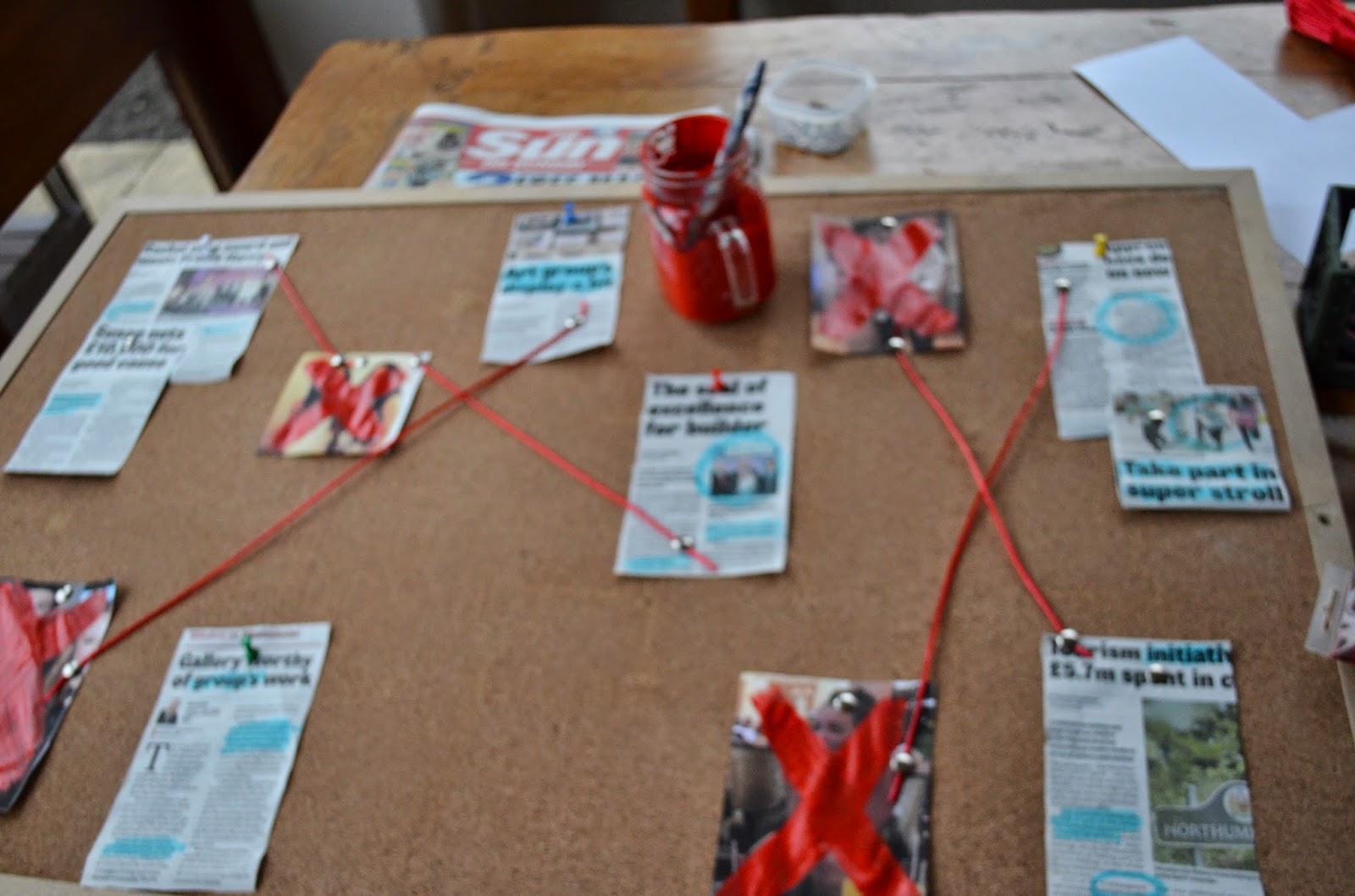
Cork board. The cord board shows intelligence within the main protagonist. It also shows her trail of thought and how she has planned out her actions, making her look more psychopathic.
Friday, 17 October 2014
Blog Diary: Week 5
This week we have contained filming. We filmed in the Quarry at night which was very dark and rather scary. However there was a disaster in the fact all site lights and LEDs had been booked out and we had no lights to light up the cage in the dark. Instead we all grabbed torches and placed them in trees, making the cage look like it had been lit up by the moon and creates a spot light on the cage which surprisingly looked really good- however after the rough cut deadline we will most likely re film the cage scene with the proper lightning however aim for the same effect of the spot light on the cage. The footage came out really good but was rather grainy, since then we have asked for advice on how to make the footage look less grainy and how we can control the lighting on the footage so hopefully when we continue you fill the shots will be better.
We also have filmed parts of the main protagonist scene, which are all filmed in a low lighting. We in this time made the cork board and scrap book. In this scene it shows Abby - as the main character - looking creepy and dark representing her as a bad character in the narrative. Filming went successfully as we asked for advice on how to light up the cork board. The only thing that could have improved filming was if there was more of the camera equipment available. This includes the shoulder mount and dolly, however we will for the final cut make sure we book the equipment out in time in order to add more professional looking shots to the footage we have already taken.
This week we also booked our studio to film the band performance. This means that we will be booking the studios for Monday 20th of October. We have already sent the band an e-,mail requesting them on what they wear and to learn the song. We have viewed the studio and noticed how professional it could become when we have the dark cloth other the room. The studio has also all the equipment in it which makes it easier for us bringing equipment to the studios. The studio also provides a sound booth which means we can record scene of Lauren - our main singer in the booth.
For next week we are filming the band performance and the last little bits of Chloe another main character, who we also filmed on Monday at the Quarry. We are also currently doing editing in order to finish the rough cut in time for Wednesday.
Thursday, 16 October 2014
Lights, Camera, Make-up!
We filmed in Cullercoats Quarry tonight for our cage scene. We found a nice dark place in the far of the woods so that none could disturb us and walk into the background. We used lots of lighting effects to create a disturbing look for our actors and so that you could actually be able to see the people inside. We used handcuff bought from Magic Box so that they all looked caged in. I also went around and added some make-up to create a beaten up face (some better than others) Soph then went around applying fake blood to add a more real life effect! The shots we took looked amazing on the camera and we really hope they fit the music video well! We are all really proud of tonight's footage


Wednesday, 15 October 2014
Props - Scrapbook
One thing we need for the music video is the scrapbook which is an important part of the narrative. The scrapbook will have photos of people who we will have in the cage. We are going to have multiple shots including close up of the scrap book and long shots of the main protagonist flicking through the scrapbook. We hope the scrapbook will portray why the main protagonist is going after these people.

Tuesday, 14 October 2014
Quarry Filming
We are filming in the quarry this week! Our props were a cage and many many leaves from the forest! Also as we left the house to go to the quarry it started to rain so we came prepared with 4 umbrellas. The rain wouldn't have effected our music video, it may have made it better but by the time we got there the rain had stopped!


Monday, 13 October 2014
Marina and the Diamonds: Digipak Analysis

Location For The Band Performance
Today we visited the Y studios as a potential place to film our band scene. The place provides all the equipment that will be needed to produce a band scene including a grand piano, guitar, drums and a microphone. The studios also comes with a singing/ recording booth in which we can film the lead singer in as well for a different location to film in. We have already planned to use the recording booth for the slow instrumental of the song, as this will be a secluded place, which is good at reflecting the song but also the main protagonist situation in the story line at the moment as well.

We are allowed to move around all the instruments and there is going to be special lighting installed in order to light up the band. Our plan is to have overall dark lighting with the band being lit up by strobe lights.The lighting will become stronger as we reach the key instrumental of the song.

There is black curtains already in the studios, but the manager has already organised to bring some more out in order to cover the whole room in black. We also will be moving the sofa and table in order to create more space. The window looking into the other room will also be covered in black cloth , which will fall over the floor to create a black floor.


If you look past the boy in the chair there you can see a purple painted photo booth which we will have access to film in. The space is small but that makes it more secluded and the purple background is the perfect colour,fitting into our overall colour scheme.

The studios also comes with many places where certain band members can chill out while we film certain close up parts of certain band members. This means the band can relax and it also helps us when we need to concentrate on certain members. Another bonus of hiring the place is that tea coffees and biscuits are free and unlimited!
We have decided to film our band here as it looks professional and offers a lot of opportunities in order to create a professional looking band scene.
Sunday, 12 October 2014
Blog diary: Week 4
This week we have created a production plan on what we need before starting to film. This includes gathering photos and designing the cork board.
Also this week we have been sorting locations by calling the y studios where we plan on filming our preformance video. We have booked to have a tour of the studios on Monday at 1.40 pm to see what lightning the room can do and how big the space is. After this meeting we will book out the space if we like it which will be £10 per hour. We plan on booking for 4 hours.
We also have been discussing outfits and makeup of the performers. We have decided to create a make up tutorial on the singers makeup, this is so we can see if we like the make up design and so we can follow it on the day to create the right make up look.
We have also booked a canvas through art and have also got an artist friend to paint the picture to make it realistic for the music video
Saturday, 11 October 2014
Marina and The Diamonds: Advert Analysis
 When analysing this Marina and the Diamonds poster the use of black and white is very effective as it shows that there is a dark side within the band, although the poster is mainly white which portrays that they are more good than bad, the grainy effect also says different. The use of colour around the band name shows that the bands itself are soft and smooth but their storylines may differ and be dark, sinister unlike themselves. The use of bold black makes the title stand out; it’s the first things your eyes draw to. Therefore the readers know exactly who the poster is about within seconds. The poster is very informative but with little writing which makes it very appealing the audience as they don’t have to read much to understand what it’s about. Also that all the relative inform action is in bold and your eyes are automatically drawn because of that. From this poster we will be using the light and dark colouring to suggest that our band itself is soft but storylines are sinister. Also we will use the use of the grainy so portray this in a different way. We will use the use of the bold title and place it in the centre so our audience’s eyes are drawn straightaway. The minimal information is appealing as it gives the audience the key information without having the read properly because of the use of bold lettering, we will use this to simplify things for our target audience and highlight the key features to kep it interesting and on point.
 Friday, 10 October 2014
Music Video Analysis:All the rowboats - Regina Spektor
https://www.youtube.com/watch?v=2CZ8ossU4pc
This is song is by the artist who also is the artist of the song we are using for our music video.
The start of the video portrays the artist being a bit weird, she is tied up with rope and it is shot in the night time, this is similar to what we want our video to look like as we want to portray the main girl to be crazy and there will be times were people are 'chained up' and most of it will be shot in the dark to add the effect of the video being creepy psychotic.
The video has a lot of quick shots that jump between the narrative and the performance, these shots go with the beat of the music, because our song is fast we will also have a lot of quick shots that jump between both the narrative and the performance, but our performance will have more of a story line to it, as the performance in this music video is linked with the narrative.
This music video is well edited with split screens and different transitions and slow motions, even though the song is very different to Regina Spektors other songs, the ue of transitions is something we are considering as it may suit certain parts of our narrative, the use of slow motion is effective and is something that we could incorporate into our own as we want to show different slow emotions of the main protagionst on the slower part of the song. However the use of split screen that Regina Spektor uses more reflect this particular song and not the song that we have chosen.
The performance camera angles are all close ups and medium shots to represent the singer and her feminine beauty as she is the lead in both the narrative and the performance, we will definitely include these shots in both our performance and narrative but will use a range of more angles as we have a full band and this performance is only one person.
The mise en scene in this music video is plain and simple, the artist is wearing plain black clothing, although her makeup and hair stand out, as she has dark eyeshadow and large hair. For our music video we want our singer to wear quite styleish but alternitive clothing such as a fur coat and doc martins, but we want our narrative actor to wear quite plain clothes but have dark lips and dark eyes similar to this music video. For this music video there is no real setting or location as its just a black or white colouring behind the singer, this reflecting the song which is slower placed than other songs we have analysed. The song is very futuristic aswell, which is why their issue of quirky lighting and background images, to show the futuristic and quirky side to the song and music video. For our music video we are having a range of locations which include a studio for the performance side and a forest, house and walkways for the narrative, as this reflects our song more. However we do want to follow the conventions that this music video sets.
At the end of this music video it reverses back to the start of it which is a clever feature in a music, we did have the idea to do this as its such a clever feature but then we changed our idea and are no longer doing it, although in time this could change again.
Thursday, 9 October 2014
Rough Cut - Production Plan
Date/Setting
|
People
|
Mise-en-Scene
|
Shots
|
Tuesday 14th October
Cage scene In Marden Quarry |
5 people total.
Dan Tom Jamie Sophie Chloe Iona |
All people wearing dark clothes.
All will have their makeup done to make sure that they bruised and battered. |
Close ups of certain people.
High angles used Long shots Mid shots |
Wednesday 15th October
Thursday 16th October Main Portagionst scene Iona’s House |
Abby
|
Props:
Apples Candles Paint Scrapbook |
Close shots
Mid shots low angles to represent power Master shot |
Monday 20nd October
Churchill – Wagonways |
Chloe
Abby |
Apple
|
Close ups
Mid shots |
Monday 20th October
Band scene Ystudios |
Lauren
Dan Tom Emily |
Tom – Bringing guitar
Crane Dolly Lights: Redheads/LEDS |
Close up
Master shots Pan left/right Extreme close up |
Wednesday, 8 October 2014
Train Track Location Change
Due to concern from our teachers and parents we have decided to not shoot on the train tracks. Due to them being live tracks, however not regularly used by the services, there has been concern in shooting some of the narrative there.
Instead we have looking into a number of different locations, which all have the forest and scary look we want to show throughout the video.
Some of these locations include:
Marden Quarry
Wagonway tracks
Blyth Tracks
We are looking into these locations to see which ones will be more ideal for us to film at and is possible to get to with all the equipment.
Paramore: Advert Analysis
 Another advert we have chosen to analyse
is this Paramore poster. The use of the shaping in the bands stance is very
stereotypical of rock bands. Staring off with the main singer in the centre and
other members evolving around her. It is also common for the band to be
predominantly male, whereas on this advert they have done this, but
contradicted it by making the lead and mostly only vocalist a female. The use
of dark yellows and blacks portrays the darkness and rock in their music and
storylines, but with having an angelic butterfly lightens this advert up more
and lets the target audience there is a softer side to the rock. The butterfly
is also featured on the hips of the female main vocalist showing that she
brings the lightness and tentatively to the group, as stereotypically that’s
what females do. The title font is simple yet affective, as its bright yellow
on a black background; this makes the band name stand out straight away. From this poster we
will take the formation of the band, as also our lead singer will be a female
and we want to emphasise that as its rock/indie bands are normally
predominantly men. We will also be using
the connotations of darkness with a lighter colour to show that the band is
dark and storylines can be sinister but that’s not what the bands all about,
there is also a joyous moment and can be happy storyline’s, but our colour will
be a deep dark red. The use of the butterfly softens the whole poster giving it
a lighter feel than most rock bands, showing that they aren’t screamo and as hard
core. We will also use the simple title, so the readers will be attracted to
that straight away and keep in with the colour scheme.
Another advert we have chosen to analyse
is this Paramore poster. The use of the shaping in the bands stance is very
stereotypical of rock bands. Staring off with the main singer in the centre and
other members evolving around her. It is also common for the band to be
predominantly male, whereas on this advert they have done this, but
contradicted it by making the lead and mostly only vocalist a female. The use
of dark yellows and blacks portrays the darkness and rock in their music and
storylines, but with having an angelic butterfly lightens this advert up more
and lets the target audience there is a softer side to the rock. The butterfly
is also featured on the hips of the female main vocalist showing that she
brings the lightness and tentatively to the group, as stereotypically that’s
what females do. The title font is simple yet affective, as its bright yellow
on a black background; this makes the band name stand out straight away. From this poster we
will take the formation of the band, as also our lead singer will be a female
and we want to emphasise that as its rock/indie bands are normally
predominantly men. We will also be using
the connotations of darkness with a lighter colour to show that the band is
dark and storylines can be sinister but that’s not what the bands all about,
there is also a joyous moment and can be happy storyline’s, but our colour will
be a deep dark red. The use of the butterfly softens the whole poster giving it
a lighter feel than most rock bands, showing that they aren’t screamo and as hard
core. We will also use the simple title, so the readers will be attracted to
that straight away and keep in with the colour scheme. Tuesday, 7 October 2014
Lana Del Rey: Advert Analysis

Location Spotting
Today we went location spotting and found some scary looking backtrack and train tracks! We thought we could use these locations for our chase scene or for the cage scene. Knowing that it could be dangerous to film on the train tracks, my dad will be supervising us to ensure that we are all safe.


Monday, 6 October 2014
Regina Spektor - Advert Analysis

From looking at this Regina Spektor advert we will use the conventions of having the colour scheme black white and red, which is typical for an alternative rock band. Although they have added the gold in for a lighter effect we will keep it basic with black, white and red to emphasise the rock. Although Regina's image is in colour, we are going to have our's in black and white or subtly having it in colour with the main features of the face bold, like the eyes and lips. This convention has been used on the advert, but we would only do this on the female singer, so that she stands out more, being the lead. also keeping with the red lips, to eep with the colour scheme and the blue eyes, to give the poster some light, as the band aren't as hardcore as 'Bring Me The Horizon' which new fans think it might be. We will also keep the information simplified as the target audience won't want to be reading for ages, they will want the most important information put infront of them with no effort to read. We will also keep the band name or album name extra bold for it to stand out more.
Studio Filming
Today we rang up the Y Studios (Queen Alexandra Sixth Form) and ask about filming our performance there. We realised that we would have to pay £10 each for a four hour session in the studio. We realised that this is a bit expensive and decided that we would have to go up and have a look around before we paid any money. We are going to look to see if the camera will fit and if everything looks professions and to be able to use the lighting effects that the studio has available. We will also be able to work out the different camera angles that we will be using.
Sunday, 5 October 2014
Production Plan : Final Cut
Date/Setting
|
People
|
Mise-en-Scene
|
Shots
|
Monday 10th November
Quarry Filming Daylight filming |
Abby
|
Abby in black eerie clothing.
the cage |
Long shots
Tracking Shots Close ups |
Tuesday 11th
Band scene |
Lauren
Dan Tom Jamie |
Band members in black apart from Lauren – who is
in black dress, white coat and red lips.
Crane Dolly |
Master shot
Close ups – extreme Pan left/right |
17th December
Cage scene |
Sophie
Iona Chloe Ollie Jack |
LEDS
All people in black and looking bruised and battered. |
Close up
long shots |
19th December
Main protagonist filming |
Abby
|
Shoulder Mount
LED Props: Apples Candles Scrapbook |
Close ups – Extreme
Mid shots Long shots |
Saturday, 4 October 2014


Subscribe to:
Comments (Atom)