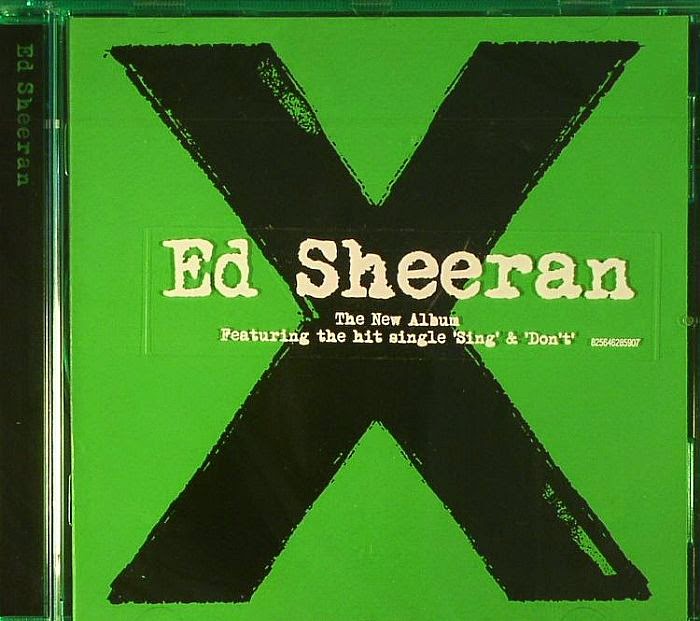
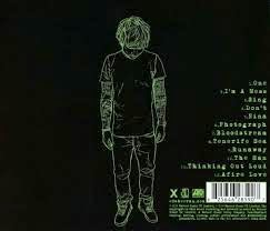
This is the Digipak from Ed Sheeran's, we were particularly interested in this one because of the X, our music video and band logo feature an 'X' which means that the X will have to be used throughout the digipak. The X is the front cover of the album but we would prefer to have this included on either the back or the inside of the digipak. We would also change the colour of the X to reflect our own band so we will probably have it a red colour. The X reflects our band aswell as we have been drafting logos in which the X is used and we want to portray the X ourselves, but through our own band genre. The front of the digipak is quite bare but reflects ed Sheeran's music, we want or front cover to reflect our genre of music by editing and giving our front image an edgy affect and including the band logo. The Cd is also quite bare but we loved the writing around the CD with X and the record label at the end, which is a convention and the logo of this particular CD, we would like to do this and develop it for our own digipak, we will do this by sticking to our colour schemes and also add the writing around the side as it shows a more quirky and different side to the artists and we feel this represents our band and genre. The back of the digipak is really interesting, although it is conventional as it includes a list of the song names, the writing is really funky and different as well as the image of Ed Sheeran himself. There is a simplistic look to the back as well, which most likely reflects the music Ed Sheeran produces, which are slow melody songs.This is most likely used because Ed is a well known artist and by using an image of himself adds to his own house style. In our digipak we will not be using an image of a band member as we will most likely use our logo which is 'X' but we will have a list of song names and try to make them different and unique by having a fun but eye catching font and coloured writing.
Over all we do want to incorporate many of the features of Ed Sheeran's album such as the use of the X and how he made it look worn which represents the old style of his songs. We want to include this X but possibly make it look more rocky to stick to our genre. The colour scheme stands out and we want to incorporate it into our own digipak and advert, by making sure that the colour scheme is used throughout. The simplistic style is something that we like but may not reflect a alternative rock album as well and stick to the bands own house style.

No comments:
Post a Comment